Chladni patterns can provide visual representations of complexity
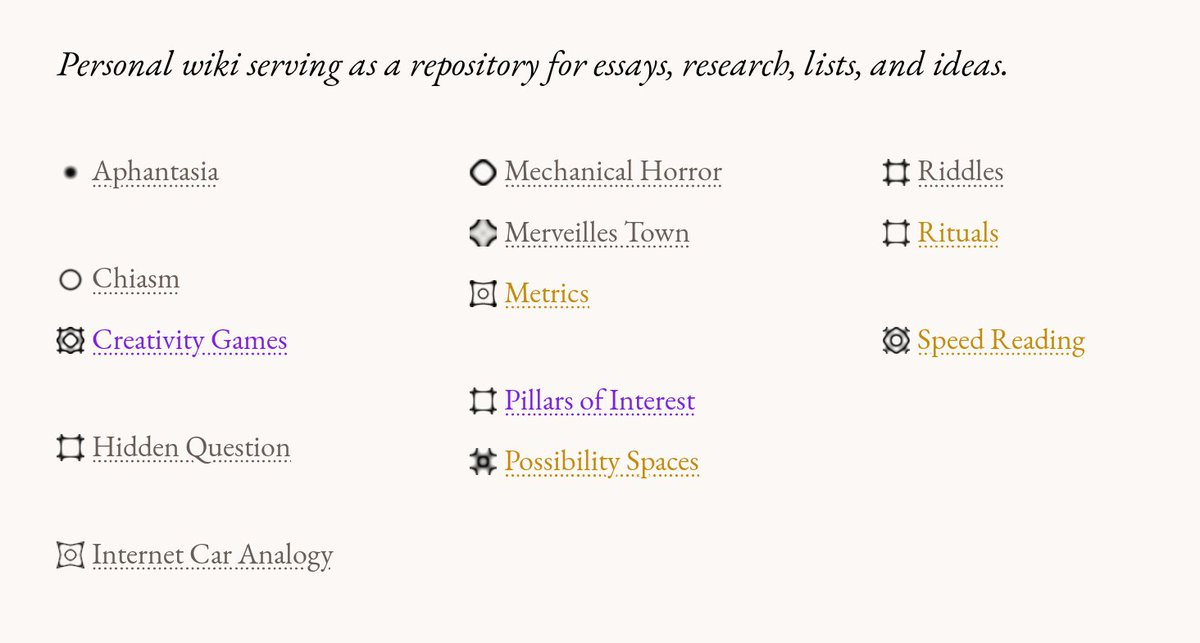
Initially experimented with using Chladni patterns to convey information about a link before you click on it. Here is an image from my wiki where the higher complexity of the pattern correlates to a higher wordcount of an individual page. However Chladni patterns could potentially have other uses in user interfaces to show visual representations of complexity.

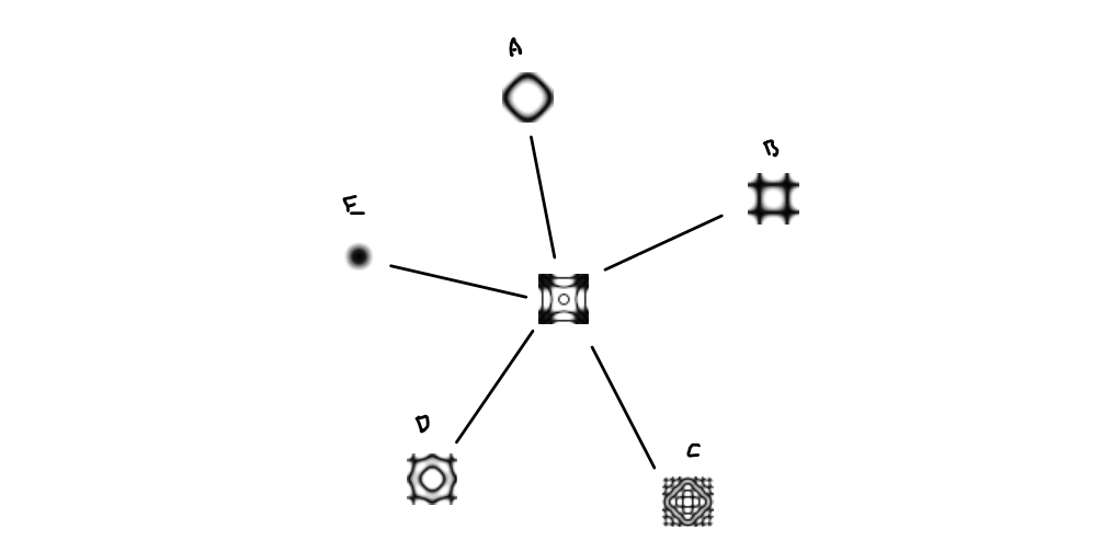
One scenario I have thought about recently is to use Chladni patterns to help display densely connected graph networks like this network of notes. It is infeasible to display too many connections because the graph will become very messy quick, but you could use Chladni patterns to represent how well-connected any given note is (without seeing links of all the notes it is connected to). This way you only need to display the local network 1 or 2 layers deep and effectively it is like you are looking at 2 or 3 layers but without the added visual noise.
